Have you ever wondered why certain colors seem to go together effortlessly, while others clash and create an eyesore? The secret lies in understanding the concept of complementary colors. By harnessing the power of these color combinations, you can unlock a whole new level of visual impact in your designs, outfits, or even home decor. So, let’s dive deeper into the world of complementary colors and explore how they can help you create striking and harmonious combinations.
To begin, let’s understand what exactly complementary colors are. In simple terms, they are pairs of colors that are opposite each other on the color wheel. For instance, red and green, blue and orange, or yellow and purple are classic examples of complementary color combinations. The reason these pairs work so well together is that they offer a strong contrast, creating a vibrant and pleasing visual experience.
But how can you actually use these color combinations in your everyday life? Let’s break it down into three categories: art and design, fashion, and home decor.
In the world of art and design, complementary colors are a powerful tool for creating emphasis and balance. When used strategically, they can make certain elements pop and draw attention to specific areas of your artwork or design. For instance, if you want to highlight a particular object or feature in a painting, using its complementary color as the background or surrounding elements will make it stand out. This technique is widely known as color blocking and is often used in advertising and graphic design to create eye-catching visuals.
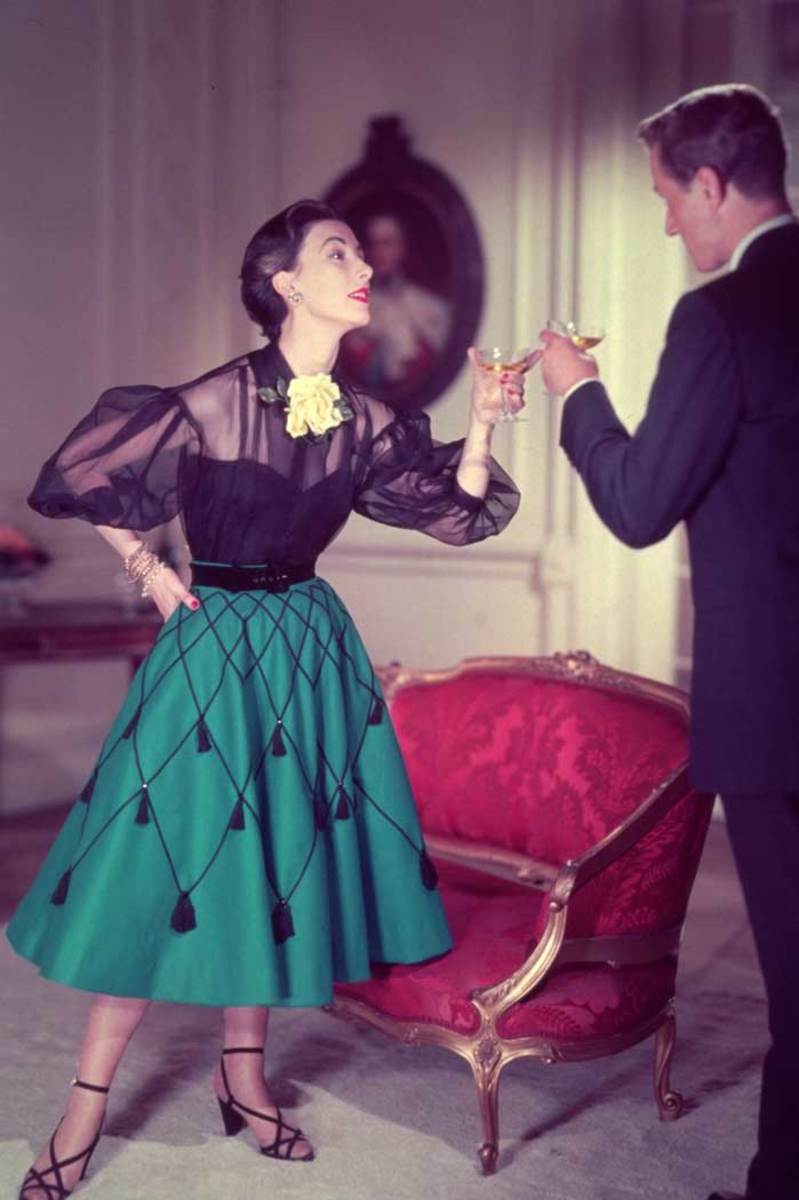
Moving on to fashion, complementary colors can elevate your style game and make you stand out in a crowd. By pairing contrasting hues, you can create outfits that are visually exciting and aesthetically pleasing. If you’re feeling bold, try wearing a deep blue dress with a pair of fiery orange heels. The contrast between these two complementary colors will make a strong and confident statement. Alternatively, if you prefer a more subtle approach, you can opt for an outfit with neutral tones and use accessories in complementary colors to add a pop of vibrancy.
Now, let’s bring the magic of complementary colors into your living space. Home decor is all about creating an atmosphere that reflects your personality and makes you feel at ease. Incorporating complementary colors into your interior design can add a sense of drama and harmony to your home. For example, if you have a predominantly blue-themed living room, consider adding pops of orange through cushions, throws, or artwork. The contrast between these colors will inject energy and create a visually striking space.
While understanding complementary colors is a great starting point, it’s important to consider the intensity and tone of the colors you choose. A high-contrast pairing can create a dynamic effect, but it may also be overwhelming if the colors are too bright or saturated. On the other hand, a low-contrast combination can be subtle and sophisticated, ideal for a more understated look.
Experimenting with different combinations and finding what works best for you is key. Don’t be afraid to step out of your comfort zone and try new color pairings. Trust your instincts and let your personal taste guide you. Remember, the goal is to create a visual impact that represents who you are and what you want to communicate.
In conclusion, complementary colors are a powerful tool for creating striking and harmonious combinations in art, fashion, and home decor. By understanding the concept and experimenting with different pairings, you can unleash your creativity and make a bold statement. So, go ahead and embrace the world of complementary colors. Let them guide you in expressing your unique personality and style.